Qantas Airways
UX and UI design along human centred and design thinking principles for one of Australia's largest online retail platforms. Projects consist of product launches and redesigns as well as continuous optimisation of existing products to book flights, seats, baggage, insurance and cars, other revenue drivers like Manage Your Booking, Where Can I Go as well as Payment and innovations.
UX and UI design activity
-
Research
Desktop reearch, interviews, qualitative and quantitave
-
Analysis and evaluation
Quantitative and qualitative
-
Ideation
Individually, in teams and workshops
-
Prototyping
Rapid and high fidelity
-
User testing
Mapping, writing, reviewing and cross checking of user stories
-
Wireframe and user flows
Structuring information and interaction
-
Optimisation
Continuous AB- and Multi Variant testing
-
User stories
Mapping sessions, writing, reviewing and cross checking
-
Quality assurance
UI and UX
-
Hands on design and design direction
Core tools: Sketch, Invision, Zeplin
Initiative and proactive activity
-
Qantas Design System
Initiative core team member – research, testing and suport
-
Audit and design library creation
Based on atomic design principles
-
Vendor review and testing
Research and test of multiple vendor solutions
-
Hackathons
Partaking and supporting AWS-sponsored and other hakathons
Projects
Booking Engine
▪ Persistent Shopping Cart
▪ Fare Watch
▪ Repeat Trip
▪ Facebook Bot
▪ Preferred Seating
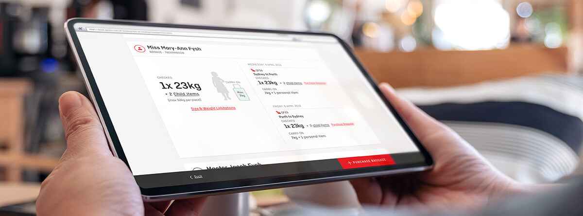
▪ Baggage Information
▪ Continiuous optimisation (MVT/AB)
Payment
▪ Global currency conversion
▪ Split payment
▪ Gift card
▪ POC for an independent payment system
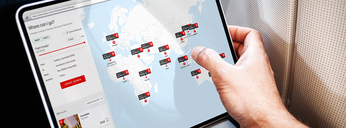
Where Can I Go and
Manage Your Booking
▪ Instant flight search results
▪ Rich media integration
Case study
Background
Observation at the airport surfaced that customers are confused about their baggage allowance, epecially for infants, children and various Qantas Frequent Flyer tiers.Challenge
Optimise the baggage information page in order to reduce Qantas call centre and ground staff engagement by customers.Research
Customer interviews were conducted, quantitative data collated as well as competing airlines reviewed.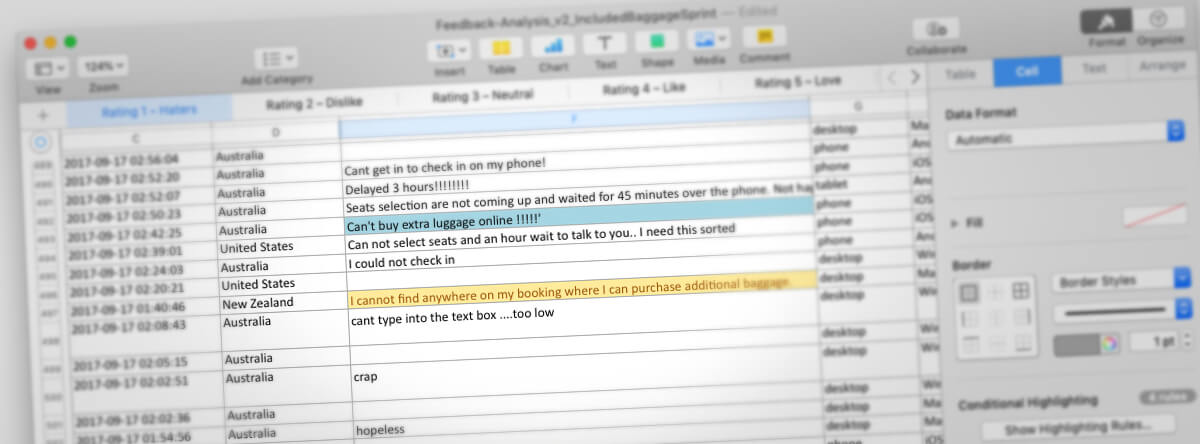
Analysis
Data from customer interviews and analysis of NPS verbatim was synthesised and trends established. This formed the basis for hypotheses, such as, that we believed, that providing only baggage information for passenger types in a booking, would reduce the dwell time on the baggage information page. Hypotheses were validated with customers at the airport using simple stimuli.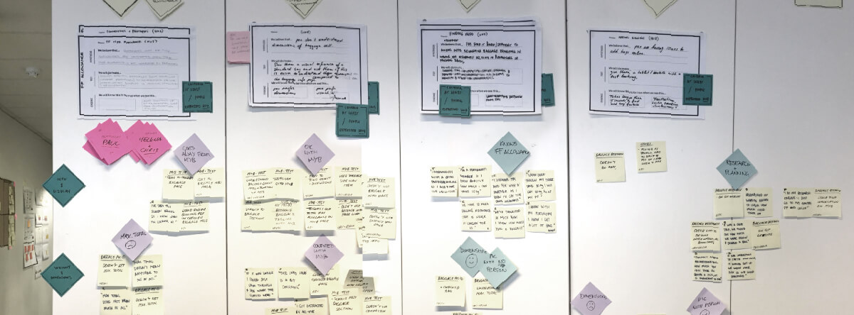
Ideation
Crazy 8s sketching sessions and brainstorms with other designers and business stakeholders led to many ideas to further explore and refine.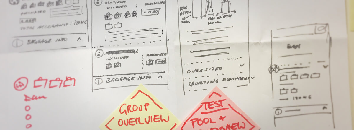
User testing
Initial design ideas were prototyped and tested with customers at Sydney domestic and international airport.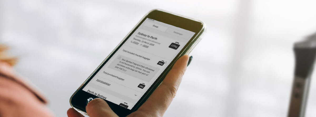
Reiteration
Test results were analysed and deltas revised, before high fidelity prototypes were created. Usability was tested in more detail through additional guerilla tests at the airports.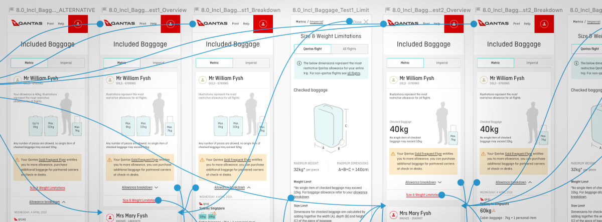
High fidelity UI design
The user interface was rolled out across major breakpoints, adhering to accessibility standards. Individual screens were designed to user story scenarios, before they were shared with developers via Zeplin. Developers' questions were discussed in Jira and weekly video conferences.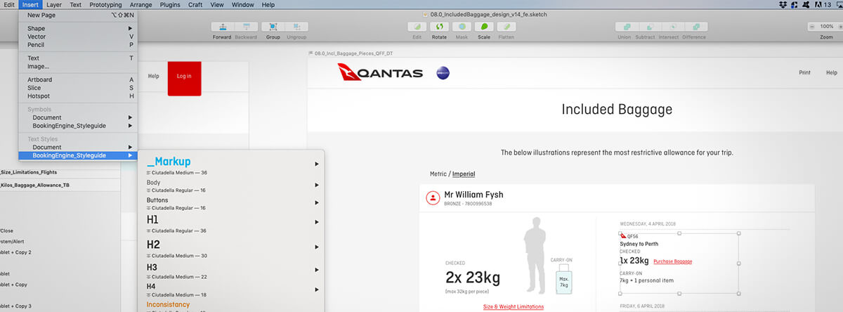
Quality assurance
User experience and interface were reviewed and corrected as the build was submitted to various test environments.